CRO
Ecommerce
Branding
TOP OF FUNNEL REDESIGN
company // cirkul
// details
project summary
01
Overview
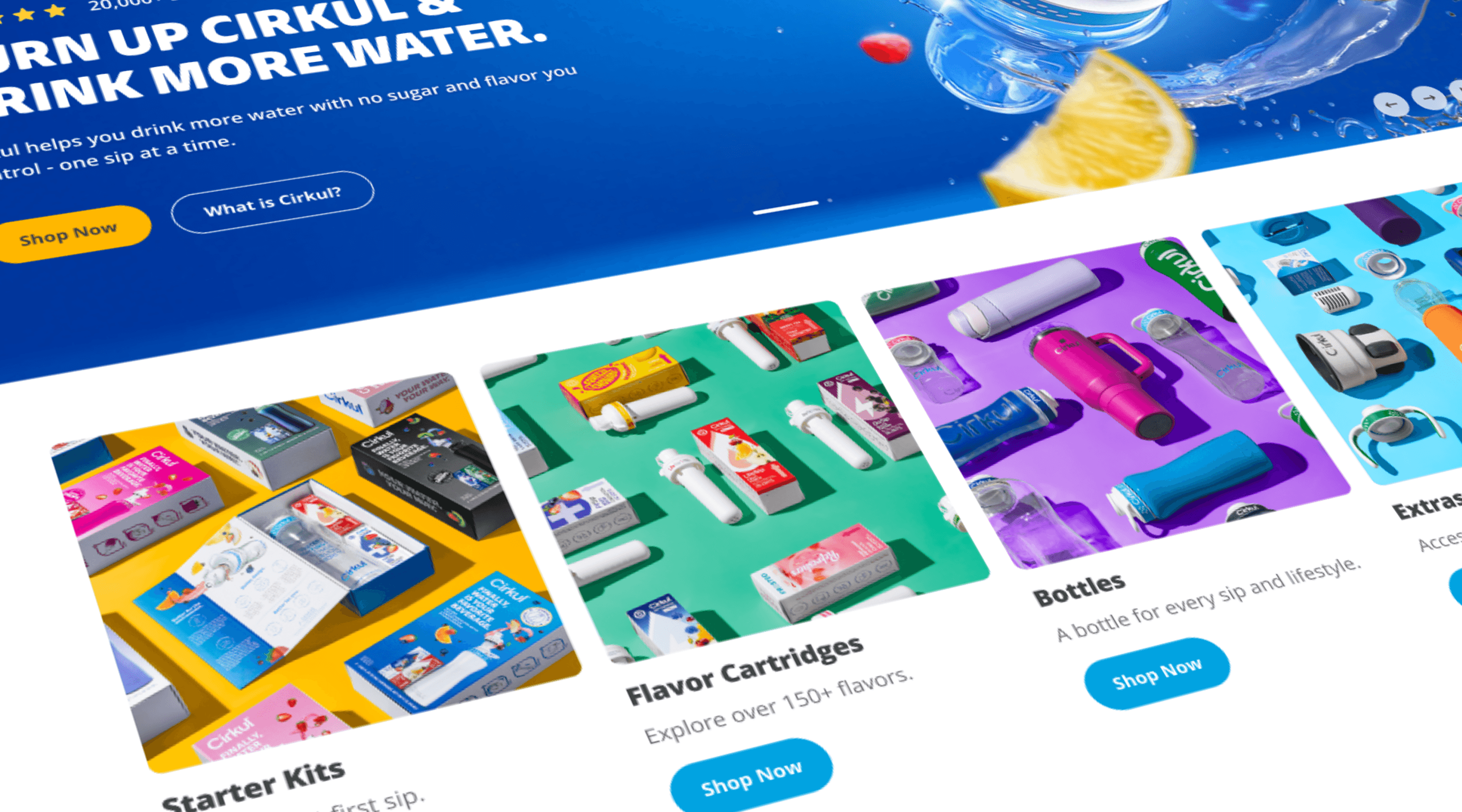
Cirkul's top-of-funnel redesign focused on the two highest-impact entry surfaces: the homepage and primary navigation.
With significant daily revenue flowing through a live DTC site, a full-flow redesign wasn't viable.
Instead, we sequenced releases by impact and risk, starting with the homepage as the primary acquisition entry point, then extending improvements to navigation as part of a broader effort to optimize the end-to-end purchase funnel.
02
My Scope of Work
Led definition of MVP requirements informed by stakeholder workshops, behavioral data, and funnel performance analysis.
Collaborated cross-functionally with engineering, brand voice, and creative to align scope across phased releases, ensuring design decisions on each surface supported the broader conversion funnel.
Owned content strategy, information hierarchy, and page layout for the homepage, with input into navigation architecture.
Partnered with PM to sequence phased releases, providing UX risk perspective to inform scope decisions at each stage
03
Role
UX Designer
Industry
Food & Beverage, DTC
Team
Developers, Brand, Designers, PM’s
Timeline
2024 - 2025
// outcome
Design Impact
Abandonment
-28%
Homepage to PLP Drop Off Rate (52.17% to 37.42%)
conversion
+2.5%
Revenue Per Visitor
Conversion
+2.8%
First-Time Buyer
// problem
Identifying the Problem
Cirkul’s homepage needed to serve as a primary entry point for both first-time visitors and returning customers, but the current experience wasn’t effectively supporting either audience.
The homepage lacked a deliberate balance between brand education and a fast path to shopping, limiting its ability to drive new user conversion while still serving the majority returning audience.
drop-off rate
52%
52% of visitors abandoned the shopping funnel before reaching the product listing page, preventing product discovery and limiting downstream conversions.
Traffic Composition
80%
Returning customers (~80% of homepage traffic) arrived with high intent, but key product pathways weren’t prioritized, creating friction for ready-to-buy users.
strategy
Beyond the homepage itself, behavioral data identified friction across the full top-of-funnel path. A full-flow redesign carried too much revenue risk on a live site generating significant daily transactions. We scoped the work into two sequential surface releases. Homepage first, then followed by navigation, each designed to validate impact before expanding scope.
How Might We…
// process
The Approach
The Initial Brief
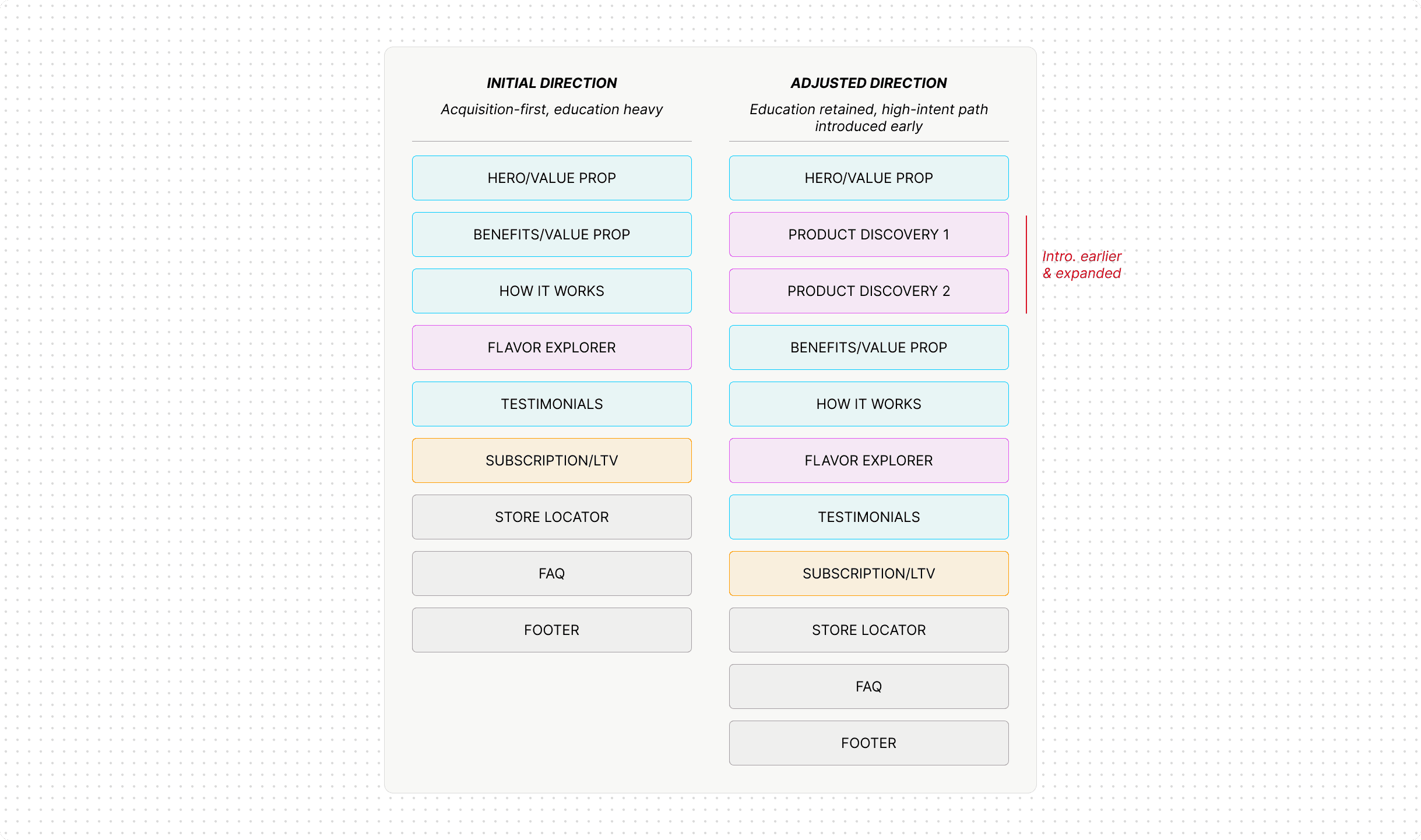
The initial brief was oriented almost entirely toward new user acquisition, a value-proposition-forward page structure that prioritized brand education from top to bottom.
The Data That Changed the Direction
Before moving into design, I pulled the existing traffic data. Approximately 80% of homepage visitors were returning customers arriving with high purchase intent. A page built primarily around brand education was creating friction for the majority of actual visitors.
Challenging the Direction & Getting Buy-In
I brought this back to stakeholders to challenge the initial direction. Getting buy-in required reframing the conversation, not as a departure from the acquisition goal, but as a necessary balance between new user education and returning user efficiency. The traffic data made that case.

Rather than choosing one direction outright, we developed a hybrid. Leading with a concise value statement paired with product imagery, then transitioning immediately to shop lanes for high-intent users. This preserved the brand education function for new visitors without creating a slower experience for the 80% returning audience.
The Decision & Tradeoff
The hybrid gave us a clear structural direction that balanced education for new visitors with immediate access for high-intent shoppers without sacrificing either.
The tradeoff: A page no longer built primarily around new user education, in exchange for significantly less friction for high-intent shoppers. A data-informed structural call, aligned with stakeholders before a single frame was designed.
// output
design direction
To validate the direction and measure impact, we used a mix of performance and behavioral signals. A/B testing via Optimizely across ~150k sessions, Hotjar scroll and behavioral analysis, and ongoing performance monitoring post-launch.
Data points
150k
Achieved across 150k sessions in a 2-week A/B test and 50/50 split
A/B Testing
Behavioral Analysis
Performance Monitoring
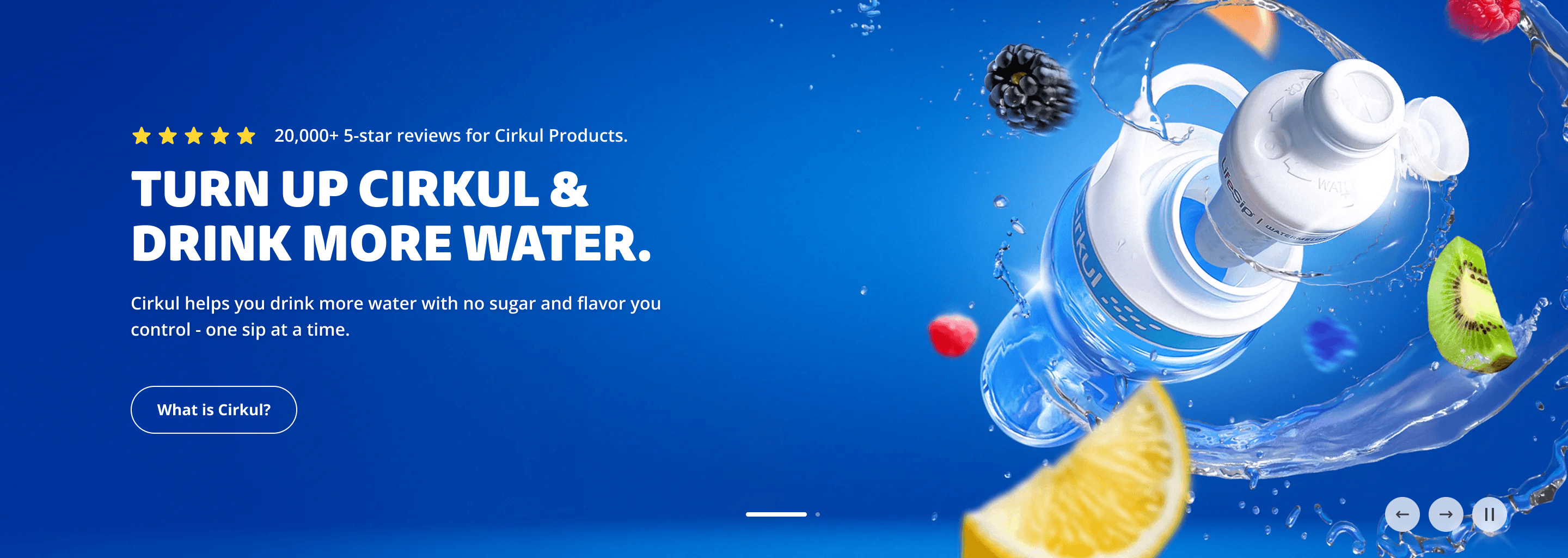
The hero serves as the primary entry point for both new and returning visitors. The value proposition leads above the fold to give first-time visitors immediate context, paired with product imagery that grounds the brand story in the physical product. The visual system reinforces brand premium without sacrificing clarity for either audience.
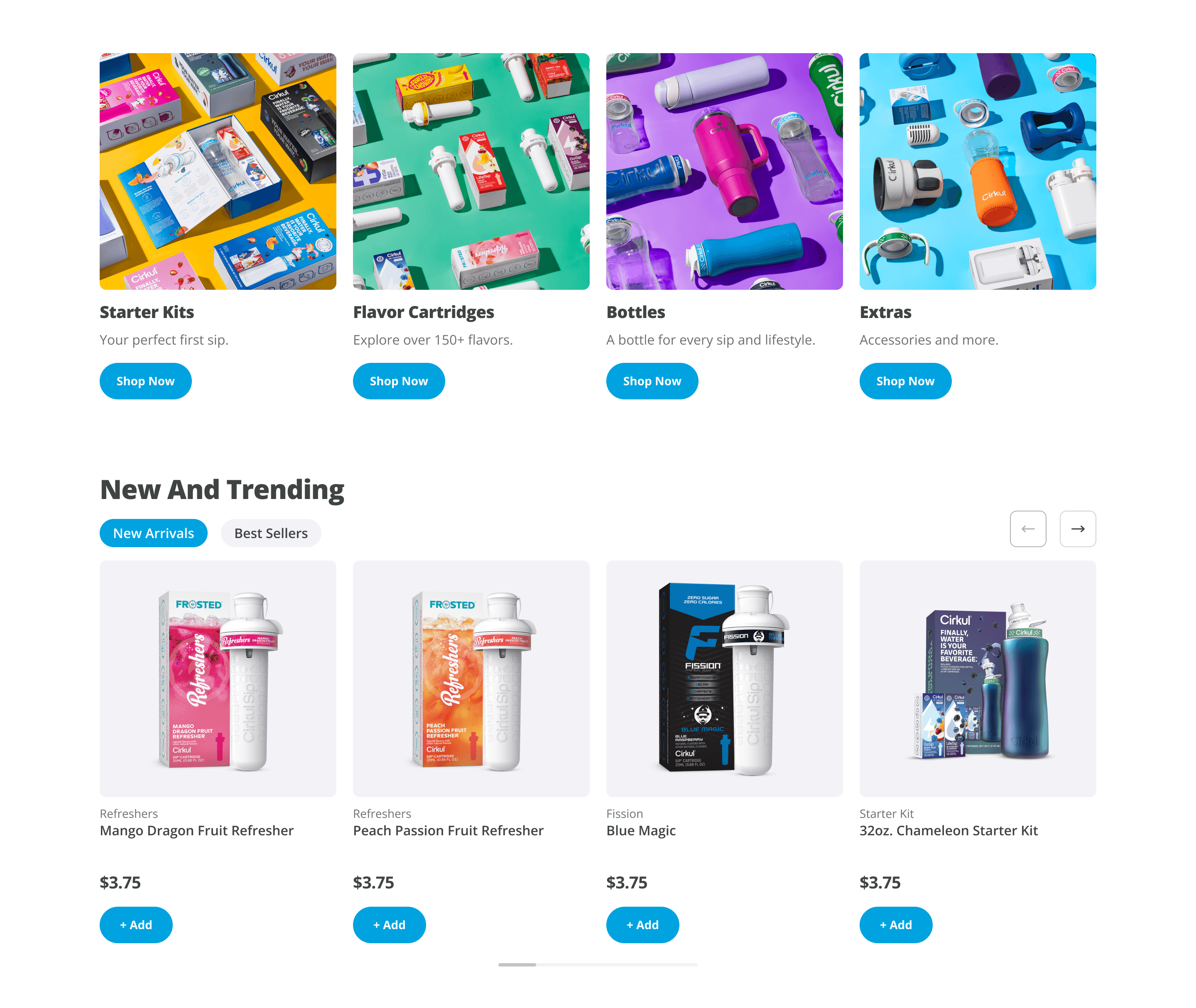
Shop lanes surfaced immediately below the hero, a structural decision made from existing traffic data. The layout follows a broad-to-specific hierarchy: categorical lanes first to help users orient and self-identify their path, followed by data-informed product carousels. Bestsellers ranked by sales, new arrivals surfacing the latest additions, and featured products curated by the merchandising team.
This two-tier structure served both audiences: returning users could move directly to a specific product, while new users could navigate by category before committing to a choice.
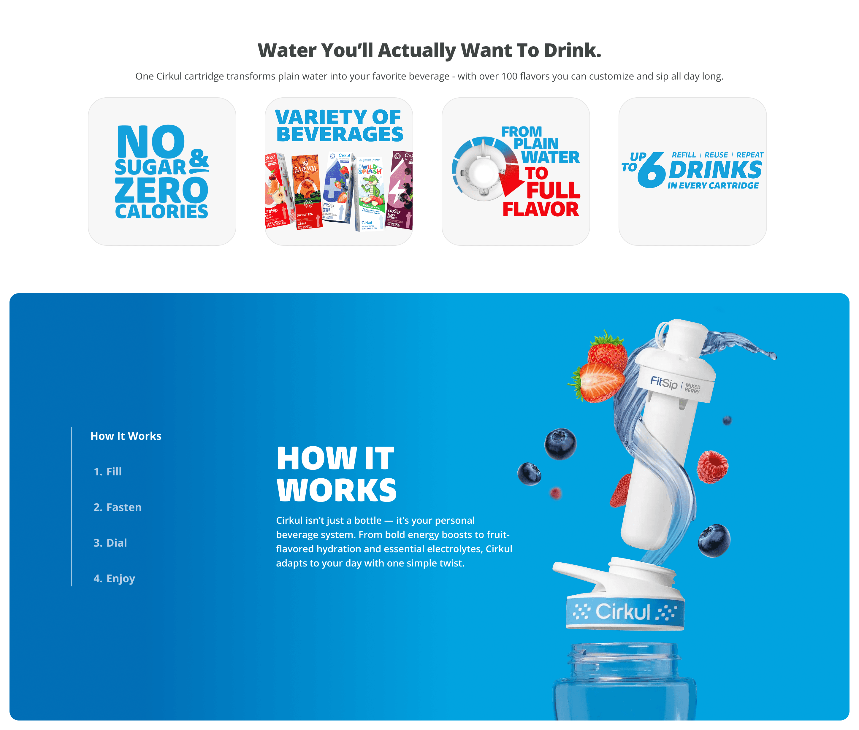
This section builds trust and understanding for first-time visitors by expanding on Cirkul's value, the product system, and why it matters, without overwhelming the top of the page or slowing high-intent shoppers.
Content is broken into small, digestible modules that support quick, benefit-led comprehension in under five seconds, followed by simple, visual explanations of how the system works. Step-by-step visuals paired with real product usage reduce confusion and build confidence, making the system feel intuitive and relatable.
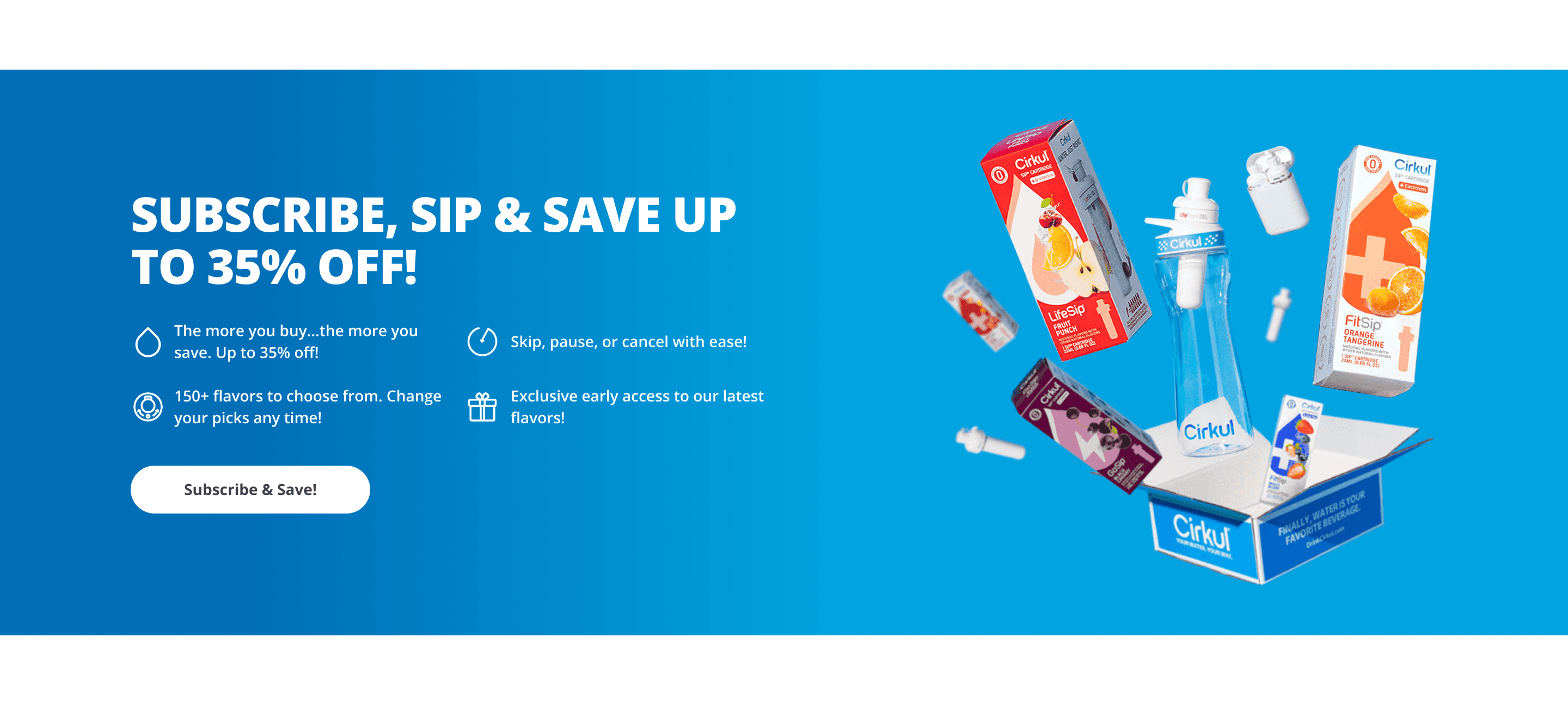
Autoship was included in the homepage redesign as a retention and LTV play , not just a feature callout. Positioning it toward the lower half of the page was intentional: users who scroll that far have already moved past browse behavior and are evaluating commitment. Placing Autoship here catches them at the right moment in the decision journey without interrupting the acquisition flow earlier in the page.
// navigation
Navigation Menu
Navigation was not initially in scope for the redesign. During customer feedback synthesis, I identified a recurring pattern of confusion around product findability that pointed back to the navigation structure. Existing categories were present but abstract, and there was a meaningful mismatch between how flavors were grouped and the benefits users were actually shopping for. I surfaced this discrepancy and made the case for including navigation in the phased scope.
Using AI-assisted analysis across several months of customer support ticket data, I calculated proportions across total relevant tickets to map user mental models around flavor and product selection. Approximately 60 to 65% of users were shopping benefit-led, 25 to 30% flavor-led, and the remainder through a layered approach. The key finding: users were not shopping by product line name. They were shopping by what the product would do for them, and the existing navigation did not reflect that.
pattern 1
~65%
Benefit-Led
pattern 2
~30%
Flavor-Led
pattern 3
~15%
Mixed/Layered
user feedback data sets
Derived from AI-assisted synthesis of customer support ticket data across several months of feedback
Hypothesis
If navigation was restructured to align flavor groupings with user benefit intent, consolidated to reduce cognitive load, and organized around user mental models rather than internal product taxonomy, users would find products more intuitively and friction between homepage entry and product discovery would decrease.
Design Decision
Categories were reorganized to correctly map flavors to their associated benefits, reflecting how users were actually thinking about their purchase. Navigation was consolidated to reduce complexity and unnecessary depth. Visual treatment was updated to align with the redesigned homepage direction.
01
highlights
Benefit-led categories surfaced at top level
Flavor-to-benefit mapping corrected
Navigation was consolidated to reduce cognitive load
// old

// New

validation
The redesigned navigation was deployed into an A/B test via Optimizely following the homepage launch, consistent with the phased approach. The test was invalidated shortly after deployment. Statistical significance was reached within minutes of launch, indicating a tracking misconfiguration rather than a real behavioral signal. Rather than accepting false data, the test was pulled. A re-test was not prioritized given subsequent roadmap demands, and the project was put on hold.
// impact
The outcome
To evaluate whether the redesigned homepage improved new user acquisition without introducing friction for returning shoppers, we measured performance across engagement, depth, and conversion outcomes.
funnel abandonment
Homepage-to-PLP funnel abandonment decreased from 52.18% to 37.42% (-28.27% relative reduction or a -14.75% absolute reduction), improving funnel progression and leading more users deeper into the purchasing funnel.
top of funnel drop-off rate
Behavioral Analysis
Hotjar scroll heatmaps showed increased engagement depth, with more users reaching key mid-page content. Scroll reach increased from 45% to 58% at the 50% scroll threshold, suggesting improvements in content hierarchy, pacing, and overall curiosity to continue exploring.
Scroll Depth (at the 50% threshold)
Revenue from First-Time Purchasers
The redesign contributed to improved acquisition performance, with revenue from first-time purchasers increasing by 2.5% (or $6.09) and first-time buyer conversion trending upward post-launch. This reinforced that the homepage balance of brand education and early product discovery better supported new users in moving from understanding to purchase.
conversion
+2.8%
First-time buyer conversion: 4.65% → 4.78% (+2.8% relative lift)
conversion
+2.5%
Revenue per visitor: $5.94 → $6.09 (+2.5% relative lift)
These incremental but directionally strong gains reflect sustainable progress on an already-healthy baseline. The modest lift in first-time buyer conversion shows that the above-the-fold value proposition and immediate shop lanes successfully reduced early friction for new visitors, while the revenue per visitor improvement confirms we preserved and slightly enhanced momentum for returning shoppers (~80% of traffic).

// reflection
WHAT I WOULD DO NEXT…
This project reinforced that top-of-funnel design on a live DTC site is as much a sequencing and risk problem as it is a design problem. A full-flow redesign wasn't organizationally or commercially viable, and pushing for one would have been the wrong call.
Though the tradeoff was a slower overall timeline and increased difficulty for design coherence between transition periods, the phased approach allowed us to move quickly on the highest-risk entry point first, validate direction with real traffic data, and build internal confidence before extending changes further down the funnel.
feature
Personalization
Leveraging Shopify and tailor merchandising and recommendations for new and returning visitors to create a more relevant shopping journey.
refinement
Keep Optimizing
Continue testing messaging, merchandising, and homepage modules to further improve funnel progression.
// Disocver More