Systems Architecture
Performance UX
Ecommerce
Cirkul Design System
company // cirkul

// details
project summary
01
Overview
As a customizable hydration platform with 200+ products, Cirkul required a cohesive system to support consistency at scale.
Built and launched Cirkul’s first design system to unify UI, reduce redundancy, and accelerate design-dev handoff. The system introduced scalable components, design tokens, and brand-aligned standards, boosting consistency and cross-team alignment.
02
My Scope of Work
Audited existing UI across existing web elements and image assets
Collaborated with engineers to define component specs and build reusable components
Established design tokenizations, documentation standards, and branding style guidelines
Facilitated alignment workshops with product, marketing, and engineering stakeholders
03
Role
UX Designer
Industry
Food & Beverage, DTC
Team
Developers, Brand, Designers, PM’s
Timeline
2023 - 2024
// outcome
Design Impact
Performance + Efficiency
Accelerated NPI releases by consolidating 1,000+ product assets into a scalable system, eliminating redundancies while improving site performance and launch efficiency.
Consistency
Strengthened brand consistency across web and mobile by unifying design standards used by marketing, creative, and engineering.
Scalability
Achieved cross-team adoption across 3 departments, establishing the design system as a scalable foundation for future growth.
Clarity
Cut design-dev handoff time, enabling faster, clearer implementation and reducing back-and-forth by aligning on reusable components.
// preview
// problem
Identifying the Problem
Cirkul lacked a design system, leading to inconsistent UI across digital products and misalignment between product and marketing teams. This caused uncertainty, slowed development, and diluted brand cohesion.
How Might We…
// process
The Approach
principles
“One brand, one experience.”
A unified visual language across products to eliminate UI fragmentation and strengthen brand identity.
“speak the same language.”
Clear standards and shared components to reduce ambiguity and streamline collaboration between design, product, and engineering.
Build once, use everywhere.
Modular, reusable components to speed up design and development while reducing duplicate effort.
Discovery
I began with a UI audit of Cirkul’s digital products, surfacing inconsistencies, duplicated patterns, and unclear standards. To understand the root issues, I spoke with designers, engineers, and the brand voice team. These conversations revealed pain points in handoff and alignment and clarified our brand’s core values, tone, and visual dos and don’ts. Their insights became the foundation for what the design system needed to support.
Building The Foundation
I translated brand values and team needs into a modular design system, built for flexibility and speed. The system was grounded in design tokens and focused on elevating consistency across all touchpoints.
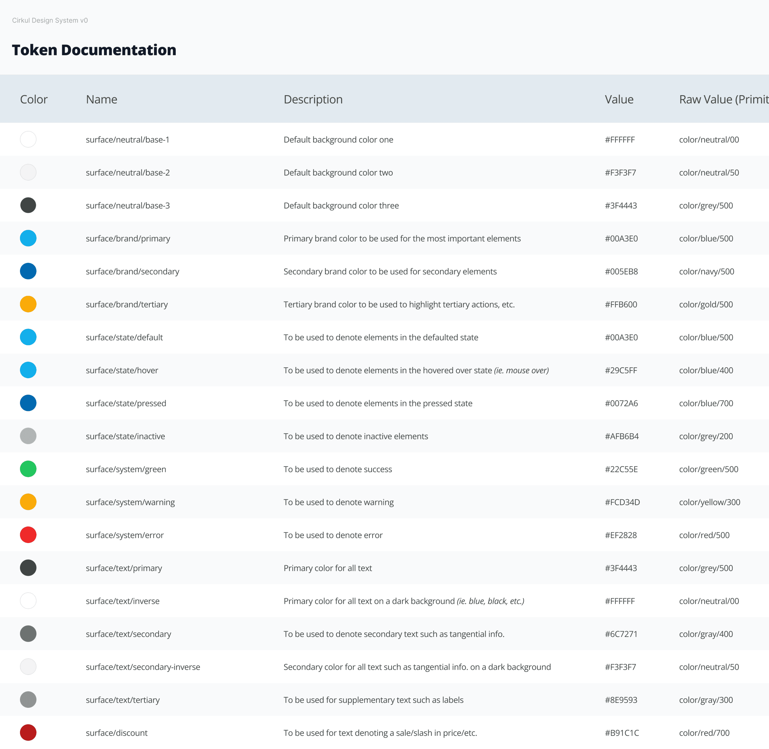
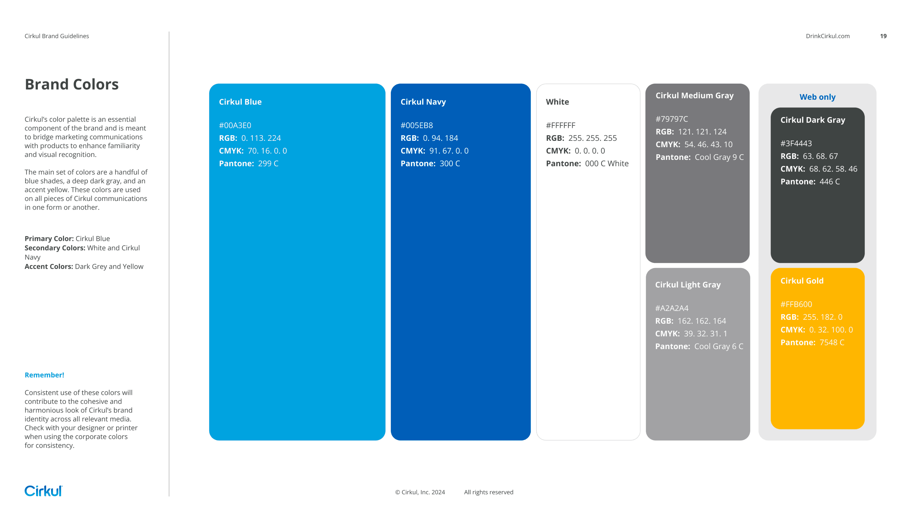
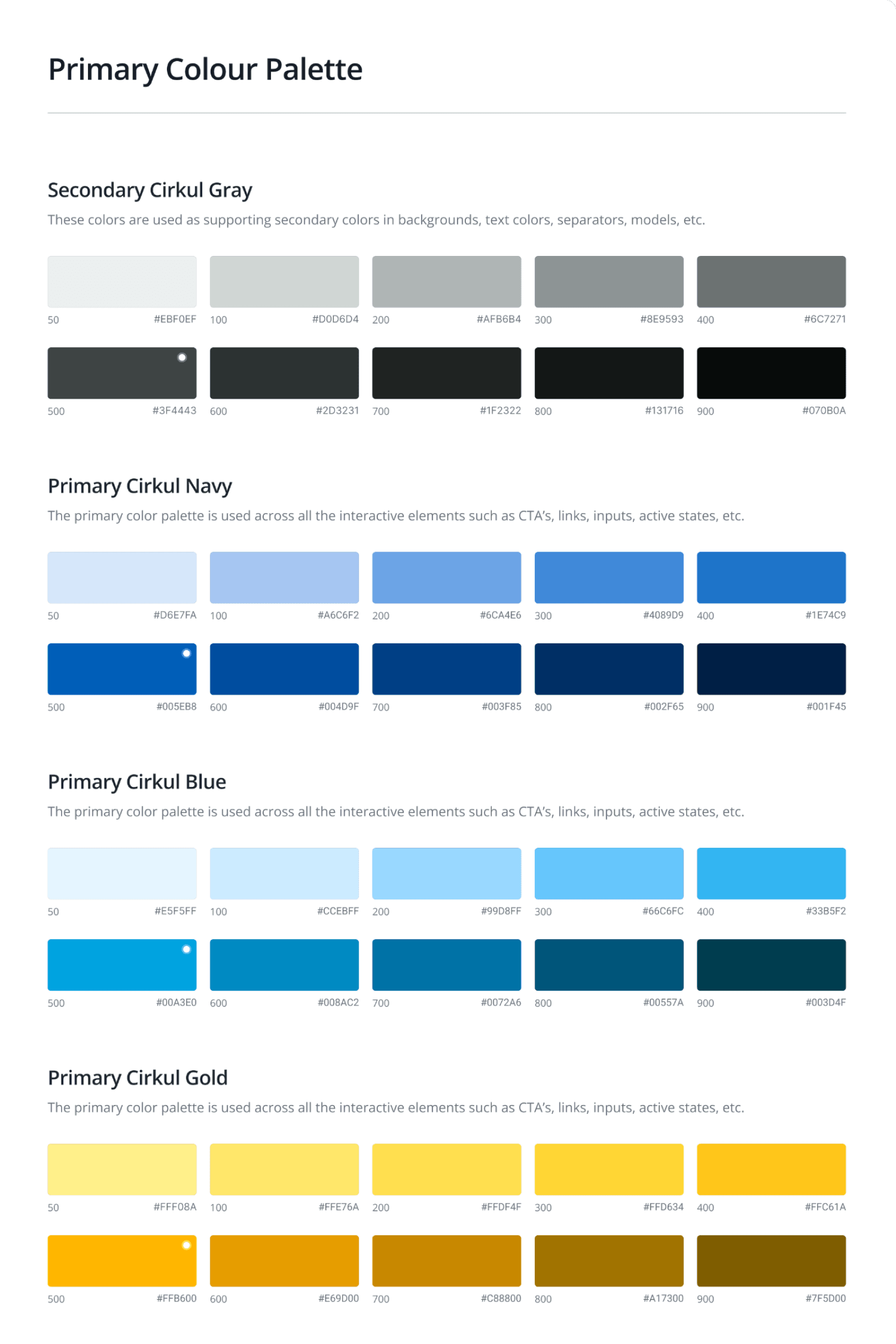
Built around four core brand colors, the system expands with thoughtful shades and tints to support flexibility, accessibility, and visual hierarchy across all use cases.
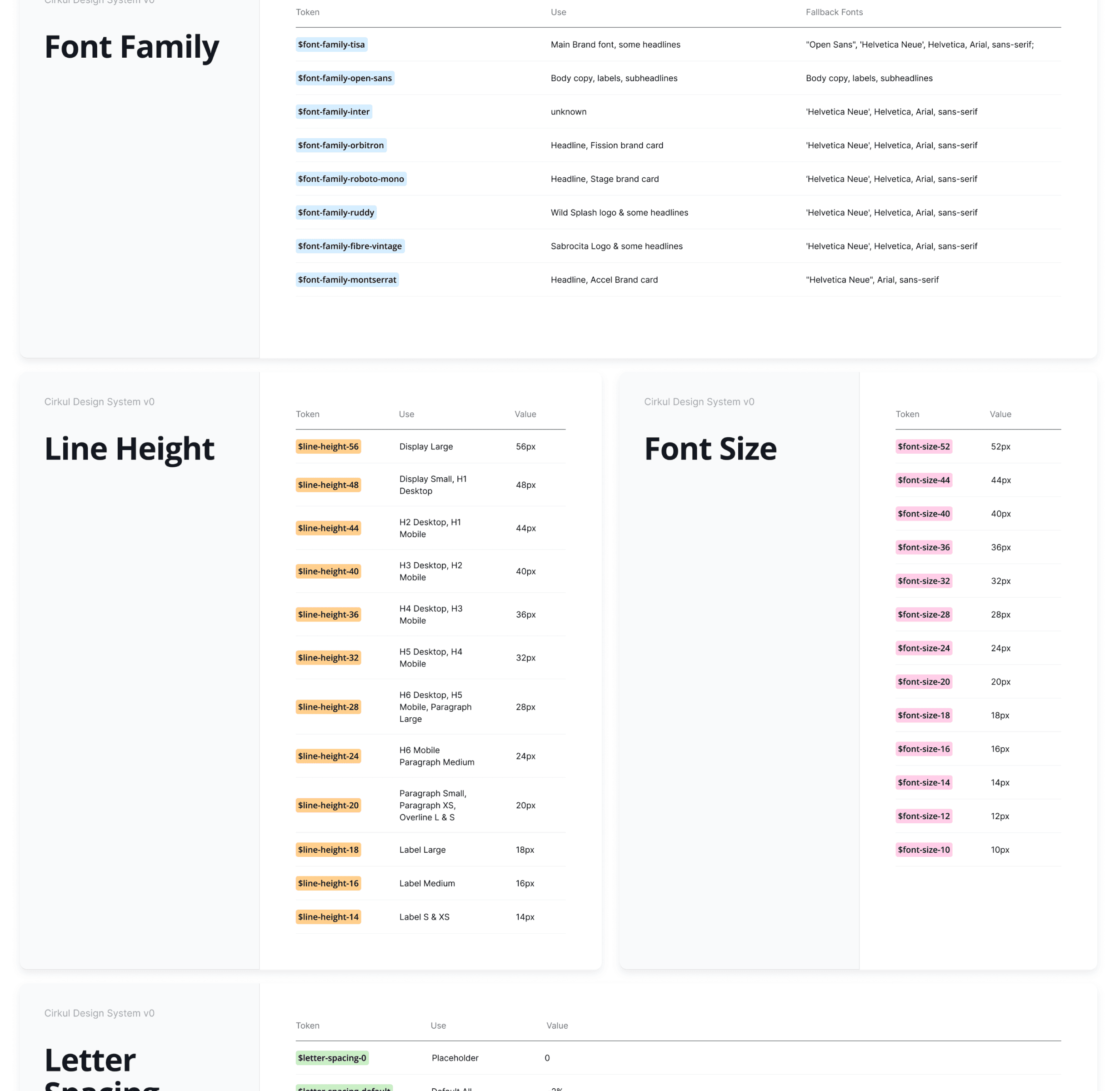
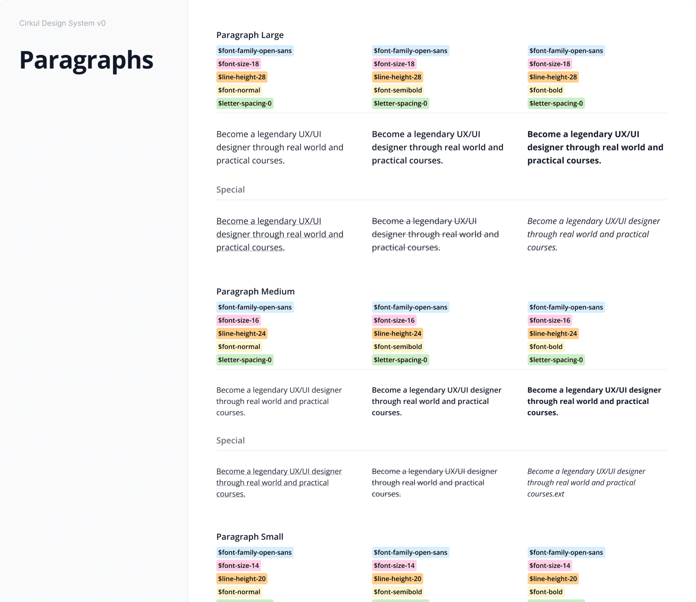
A modular, harmonious typography scale designed for clarity, consistency, and scalability across web and mobile interfaces.

Created a token system using primitive and semantic taxonomy ensured consistency, simplified theming, and enabled seamless scalability across components, platforms, and future design updates.

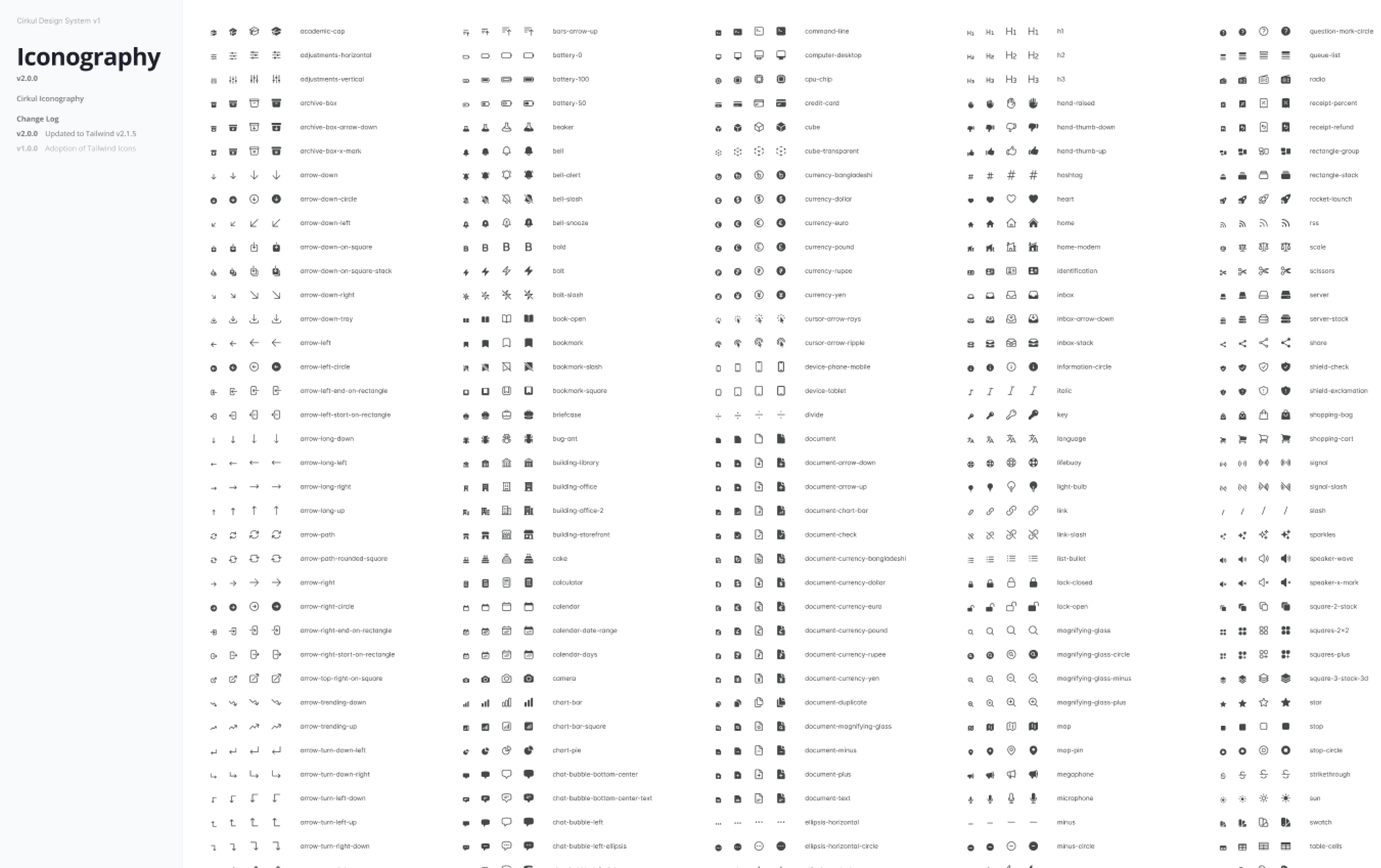
Built a library of reusable components to accelerate design workflows and reduce duplication across product and marketing experiences.
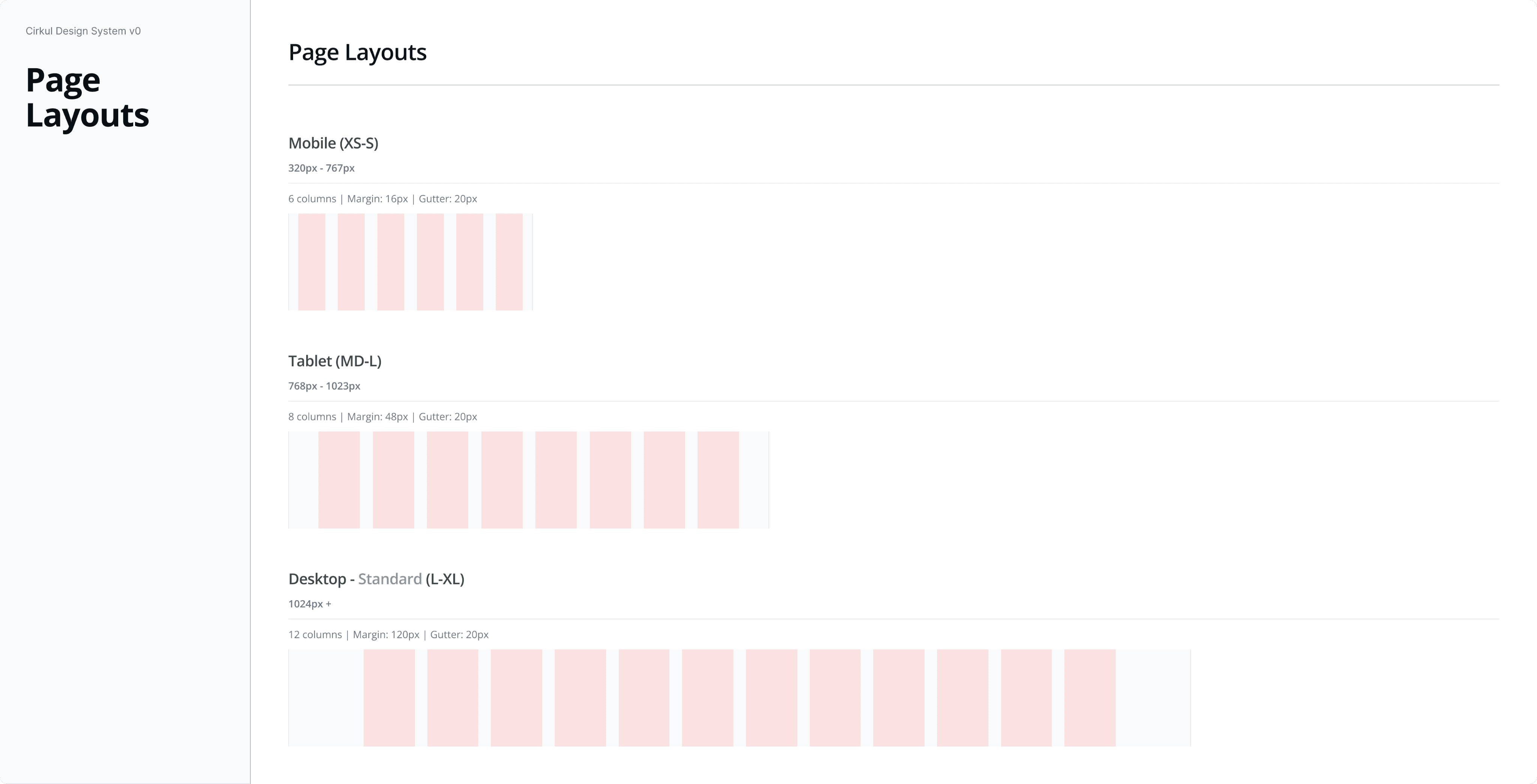
Collaborated with developers and defined a single flexible 12-column grid system tailored to mobile, tablet, and desktop breakpoints, providing structure, alignment, and scalability for modular layouts across the entire design ecosystem.
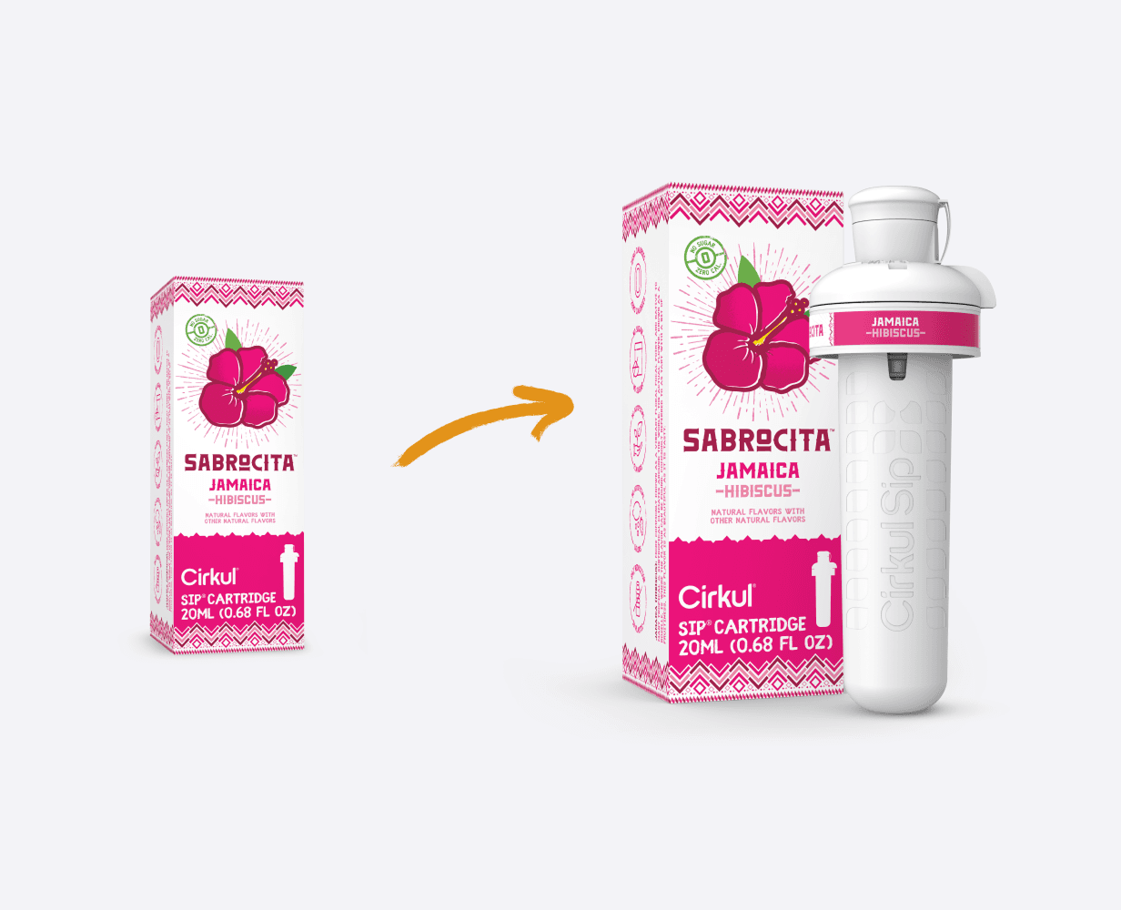
Flavored cartridges make up more than 81% of our Cirkul’s revenue. One re-occurring problem we encounter from new customers is – “Do we sell pods? Powders?” Displaying only the box art as the product image provided no value and added friction.
To reduce the ambiguity and boost buyer’s confidence, we overhauled and standardized 200+ flavor product images to include the flavor cartridge.
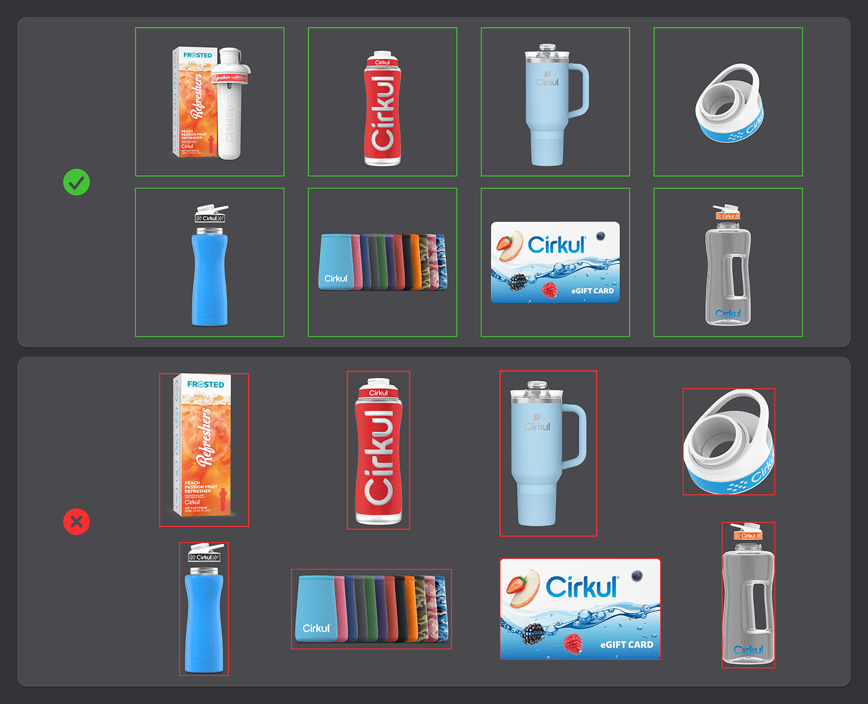
We standardized all product images to a 1:1 aspect ratio, streamlining design-to-dev handoff and ensuring scalability across touchpoints.
// impact
The outcome
Brand Consistency & Scalabilty
Unified design standards across web and mobile, achieving cross-team adoption and establishing a scalable foundation for brand consistency and future growth.
page weight
Cut total asset size from 95MB to 50MB on our highest-converting page: The Bundle Builder page.
a faster website
page load
Reduce page load speeds from 2.0 sec to 1.4 sec
a faster website
// reflection
WHAT I WOULD DO NEXT…
Building Cirkul’s first design system established a shared design language across teams, laying the foundation for a more modern, consistent, and scalable product experience. While still evolving, it now serves as a single source of truth, enabling faster collaboration and a more cohesive brand experience.
// Disocver More
Check Out Other Projects